In my last blog I used overview data to compare the GCSE results this year to last year, as well as looking at the grade boundaries for different boards. The survey data collected allows me to look more specifically at the results of departments. So for example, big data suggested that the proportion of grades was essentially similar to last year, but it was impossible to tell if this was because departments did the same, or because some did brilliantly and others appallingly.
In this blog I am going to try to pull out some answers to key questions I am hearing a lot on Twitter and Facebook. Please note that this data is only a sample of 363 schools, all of whom engage actively with social media, so the data is mostly suggesting things rather than proving anything. However, I did manage to get a broadly representative sample in terms of the distribution of data around the 65% 9-4 average. For more on the data set please see the end of the blog. If you'd like a fully anonymised copy for your very own, please do let me know.
As each post is quite long I have indexed the questions here:
1. Were results more or less stable in 2018 compared to 2017 - Read On Further
2. Did teaching a 2 or 3 year curriculum have the biggest impact on 2018 results?
3. What impact did exam question practise have on results?
4. Was the A*-A / 9-7 rate affected?
5. What impact did non-specialist teaching have on grade stability?
Conclusions
In lost of ways I am glad I cannot draw many clear conclusions from this data. The slight differences between results from 2017 to 2018 suggest that departments have not been unduly hit by these changes and these is a broad level of fairness in how they have occurred. While some departments clearly will not be pleased with their results (and others by turn delighted), this is not unusual in the picture of GCSE. The only slight impact here may be that departments who have been historically stable, are now in a category of less stable schools. However, to assess this, I would need data going back further, and probably in more depth.
What I do now have is a large bank of data on the 2018 exams, so if anyone has a question they’d like me to investigate using the dataset I have, please do get in touch.
NOTE: For almost all of these explorations I have compared results in terms of stability. So for example 2018 stability is calculated by comparing a school’s results in 2018 with their results in 2017. If the results are in the same bracket, then I would consider them broadly stable. If their results this year were a bracket or more above last year e.g. last year they got 50-59% A*C and this year 60-69% 9-4, then they are consider as doing better, and the reverse if they are lower this year.
1. Were results more or less stable in 2018 compared to 2017?
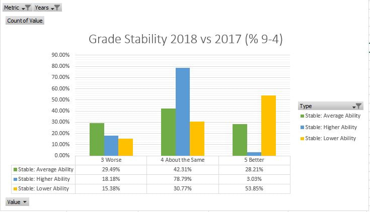
This picture is fascinating. It seems that the vast majority of higher achieving schools remained broadly stable, whilst lower achieving schools actually were more likely to improve their results. The middle band of schools showed the most diversity in terms of stability between 2017 and 2018.
A final comparison is to look at schools who were not stable between 2016 and 2017. There were no major differences in terms of school type here and very little in terms of board.
EDIT: I have updated the figures here after noticing a calculations error.
For schools whose results were falling between 2016 and 2017, around 47% stayed in their new grade bracket, 15% got worse, but 38% improved, reverting towards the mean. This means if you got poor results this year, it seems unlikely you will fall further.
Next Question
Data Info and Caveats:
In total 363 schools responded to my survey. Of these, 26 were independent or private, 2 were special schools, 228 were state academies, 7 free schools, and 100 LA controlled schools. It is perfectly possible that a single school may have answered the survey twice or more.
I am aware that the boundaries for results have a lot of scope for error, however they broadly fit with the national distributions, so I am happy with the approximation.
My metrics for calculating percentages of the course taught, non-specialists etc. are far from ideal, but again this was aiming to give a broad brush picture.


 RSS Feed
